


 Explained")


")


Google has been actively pushing its Material UI Design to most of the services/products, such as Android OS and Gmail. Google Chrome’s overall design has not been overhauled for a few years. And today, Google has released an update to the Chrome Canary browser, giving the browser a refreshing look.
In this version of Chrome Canary (69.0.3489.0 canary), you could expect visual changes from the omnibox suggestion bar, pinned tabs, tab shapes and colors. There is no more solid boundaries between each tab. Tabs are only separated by color difference and a ” | ” now.
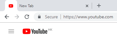
Everything inside the browser becomes a lot simpler and cleaner. All buttons and address bar are circles or have rounded corners.
Apart from visual difference, there are no words for performance or speed improvements. The new UI design is definitely a welcome change for Google, which allowing Chrome to finally match with other modern applications in terms of design/look. We should be able to see the new updates rolling out to the public in the coming months, after bugs have been fixed in the Canary version.
Feel free to leave comments below, if you have any opinion about this website. Share the website around if you enjoy reading it. Subscribe to our Newsletter or follow our Google+, Facebook and Twitter.
Support this website simply by shopping in Amazon. It will give us small kickbacks, if you use the above affiliate links to make any purchases, which will help us grow.